Ottolenghi Test Kitchen
London | 2020
Ottolenghi OTK
Kitchen transformation
“Nina and her Studiomama team have managed to transform our test kitchen from a nondescript industrial unit under a grubby railway arch line into a sunny, happy space, where the functionality is perfectly adjusted to our needs: recipe testing, food photography and office work. Simply being in the room is now a joy. Top professionalism!” – Yotam Ottolenghi
Ottolenghi’s design brief
‘You never know when you will move on – so let’s make something which is sustainable, affordable and can move along with us. The nature of a test kitchen is that it is flexible, and we can quickly and easily change the feel of the space.’ – Yotam Ottolenghi
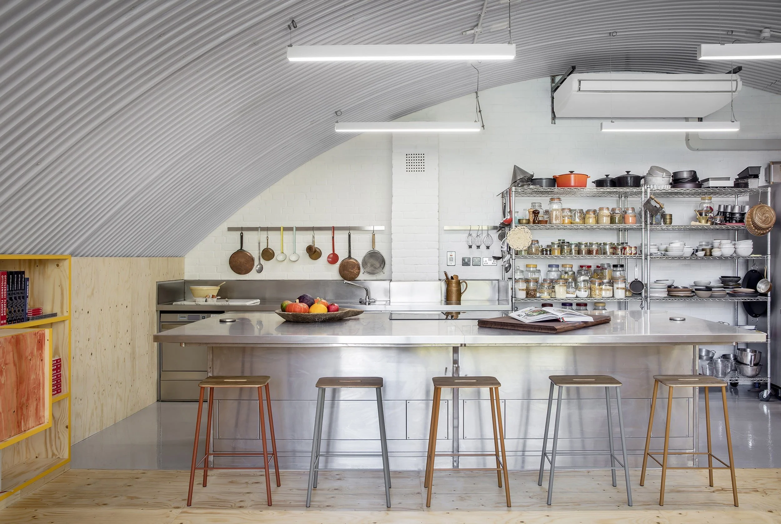
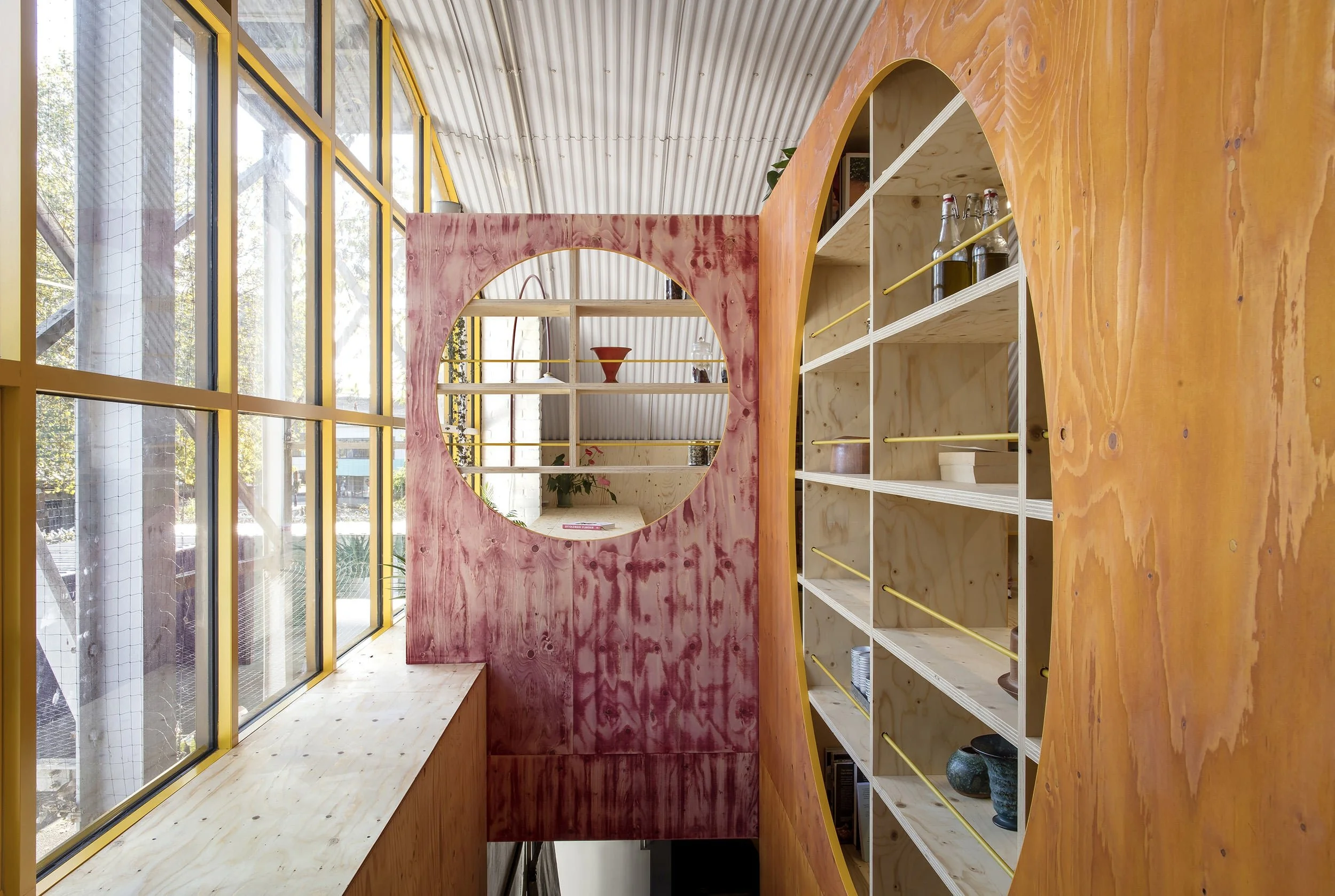
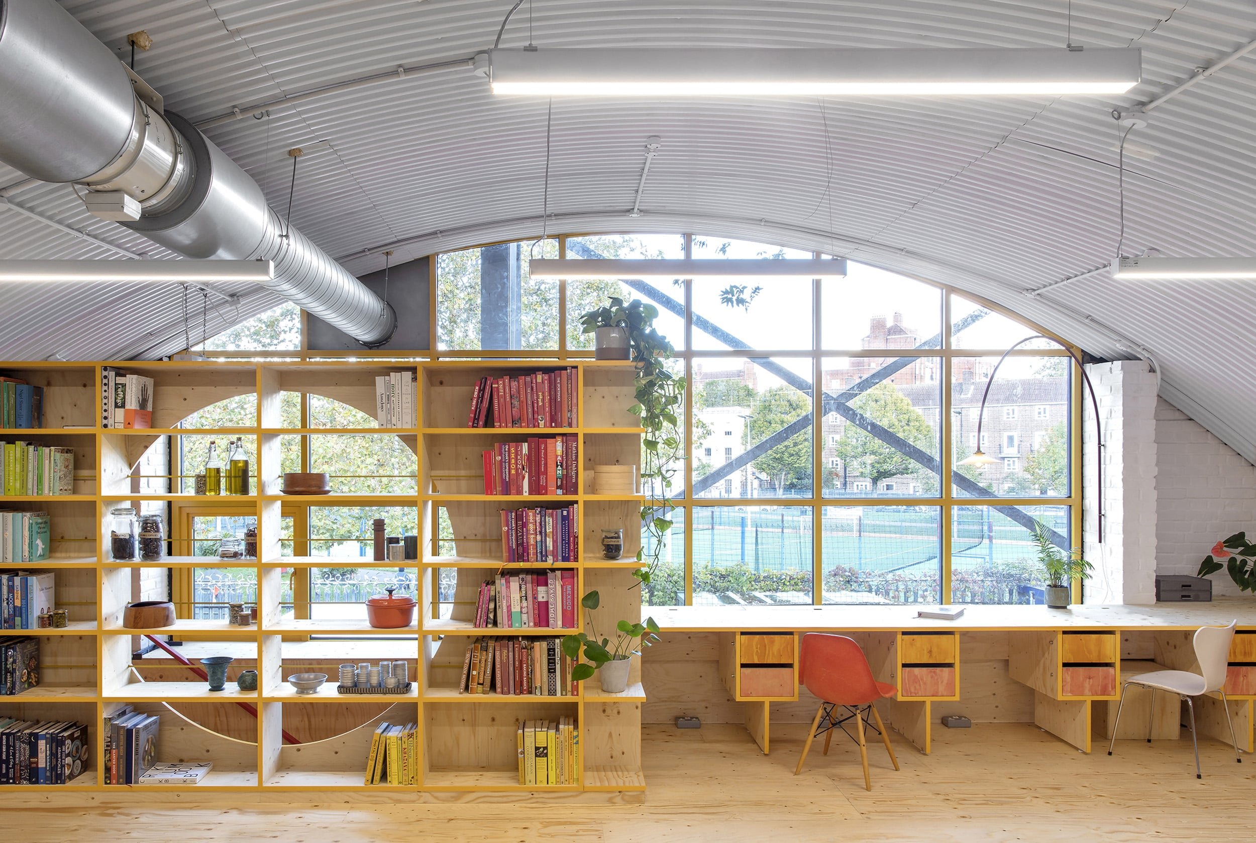
Studiomama used off-the-shelf building materials for this post-lock-down summer project – and up-cycled and re-invented the existing catering equipment. Located in a railway arch in north London, the building's fabric could not be altered. To tie the space together, we painted the existing window grid bright yellow and used matching yellow edging for all the ply. Also, the 2mm impact-resistant yellow edging gave the otherwise soft material the protection and durability it needs.
The staircase entrance has a colour splash of dyed ply which creates a visual reference to the colour of spices and Ottolenghi’s signature raspberry meringues.
Studiomama also changed the light fittings to cost-effective LED dimmable lights that sit closer to the ceiling and add to the greater sense of space. A red hanging lamp by Muller Van Severen echos the shape of the arch and gives light to the desk table.
The space has two separate and inter-connected functions where office/desk work and cooking happen simultaneously. There is a clear division between the two – the kitchen part in stainless steel with grey food-safe flooring (that fits all requirements for a commercial kitchen) and a warm, colourful studio space with an extensive library of cookbooks as well as desk spaces.
For social distancing, the cooking area and workstations face the same direction, and the kitchen islands have also been enlarged to ensure social distancing while working or gathering.
Additional daylight – and extra floor space – were gained by extending the mezzanine over the staircase. The extra space made it possible to create a photo studio for documenting new recipes.
Studiomama created a materials library in a storage unit – containing different backgrounds – as a backdrop for photographing new dishes.
DESIGN: Studiomama
CLIENT: Ottolenghi, OTK
PHOTOGRAPHY: Rei Moon


